The Brands
Where to go?
I have previously decided that these areas of the brands behind the clothing that I own are important. I think that by researching the backgrounds of the companies I will be able to develop a deeper understand of what they are all about / how this ties in with their products / how they visually represent this. Where possible I plan on visiting local outlets of some of the fashion retailers from where my clothes are from and recording what their stores are like inside and outside just to get a greater feel for them.
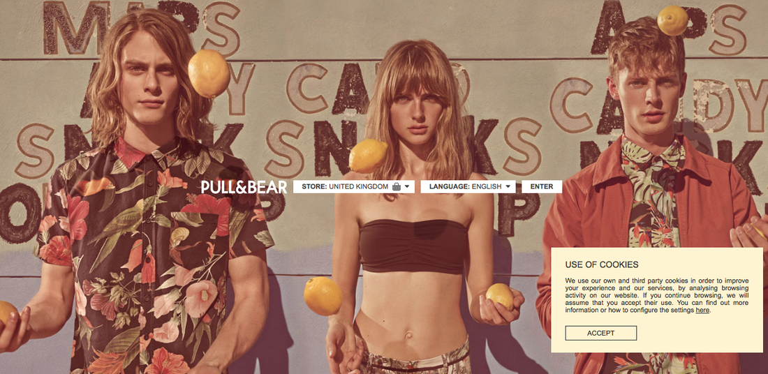
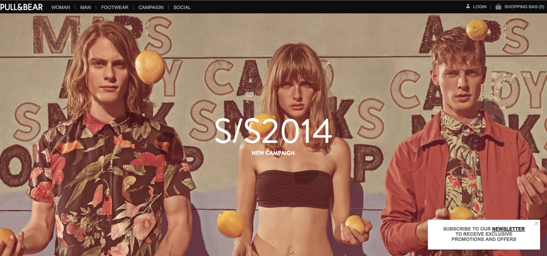
From researching the brands and gathering this information it has become obvious to me that through at least the corporate identity and brand presentation of these companies that many of them utilise similar stylistic approaches that could be deemed as suitable for the 'Western' world. Of the 11 brands that I have within my wardrobe, 8 of them feature a colour scheme for their branding and logo which utilises a colour palette of simply black and white.
- The manufacturer / seller of the clothes / Who they are / Their history / Company branding
- Brief company history, helps to understand where they have come from to now.
- Company branding / imagery
- Company ethos and values, is this reflected in the products themselves and how/where they are manufactured.
I have previously decided that these areas of the brands behind the clothing that I own are important. I think that by researching the backgrounds of the companies I will be able to develop a deeper understand of what they are all about / how this ties in with their products / how they visually represent this. Where possible I plan on visiting local outlets of some of the fashion retailers from where my clothes are from and recording what their stores are like inside and outside just to get a greater feel for them.
From researching the brands and gathering this information it has become obvious to me that through at least the corporate identity and brand presentation of these companies that many of them utilise similar stylistic approaches that could be deemed as suitable for the 'Western' world. Of the 11 brands that I have within my wardrobe, 8 of them feature a colour scheme for their branding and logo which utilises a colour palette of simply black and white.
The Brands
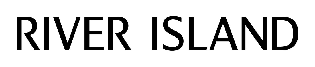

River Island
Established in 1948, River Island is a privately owned British fashion empire with over 300 stores situated globally through the UK, Ireland, Europe and Asia. Specialising in high quality, stylish and affordable clothing, shoes and accessories River Island has its own in-house team of designers ensuring that garments are frequently released.
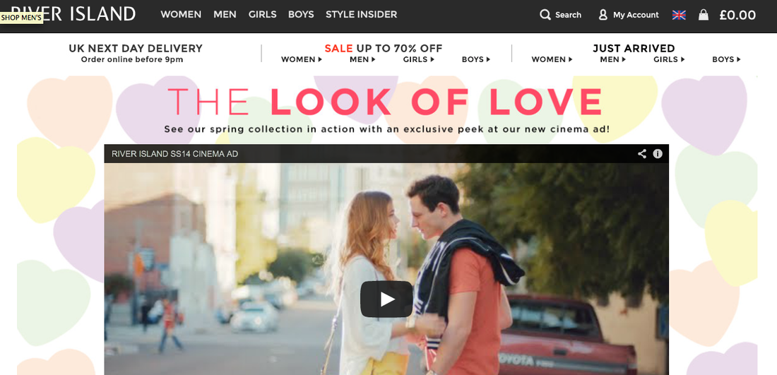
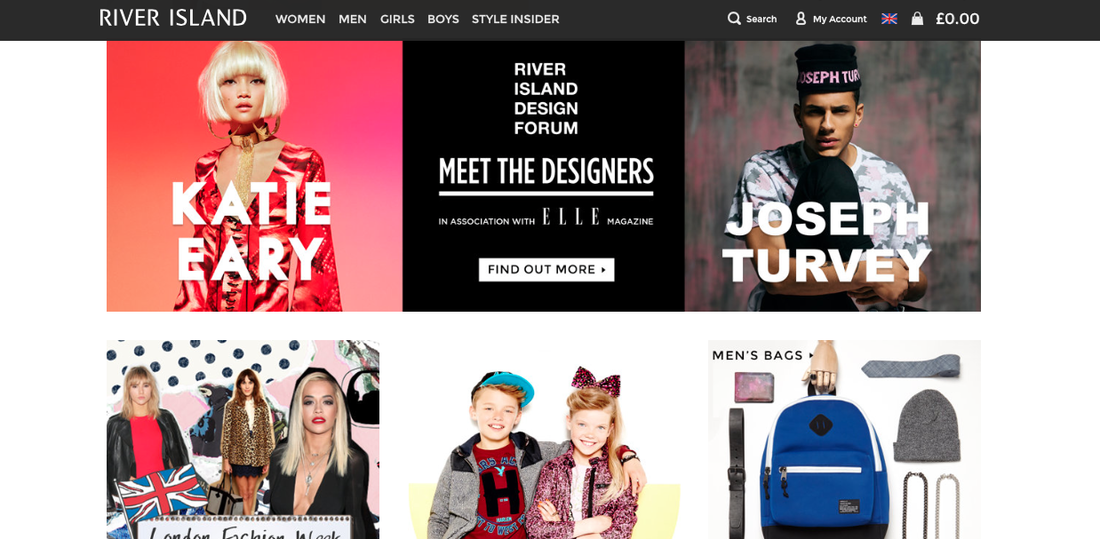
River Island has a very sleek logo using a very minimalist colour palette of black and white. This successfully emulates the brands ethos of providing 'stylish and affordable' fashions to the consumer. The online website is an extremely engaging, responsive web design that was recently launched, which successfully works across varying platforms such as mobile. This reflects its desire to appeal to a young, modern audience which it is enable to connect with using its online platform, such as its online store and social media outlets.
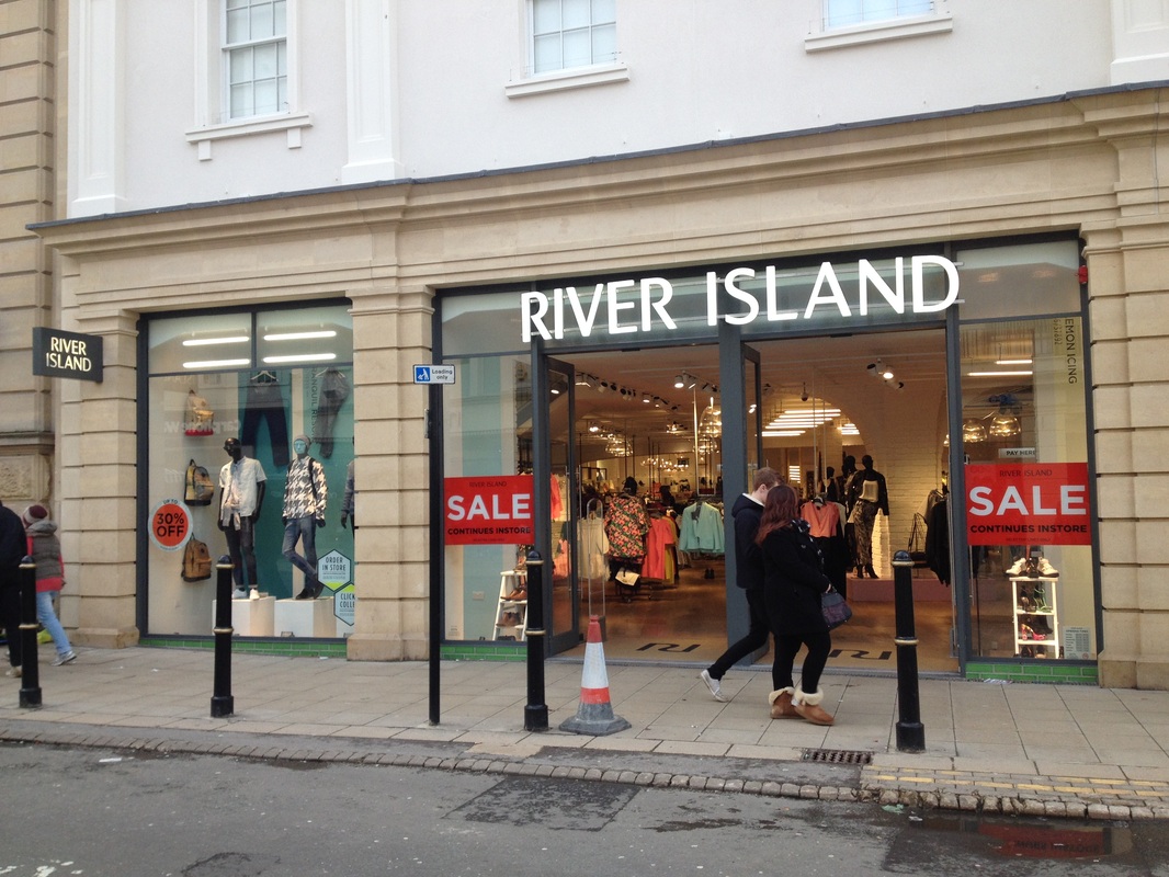
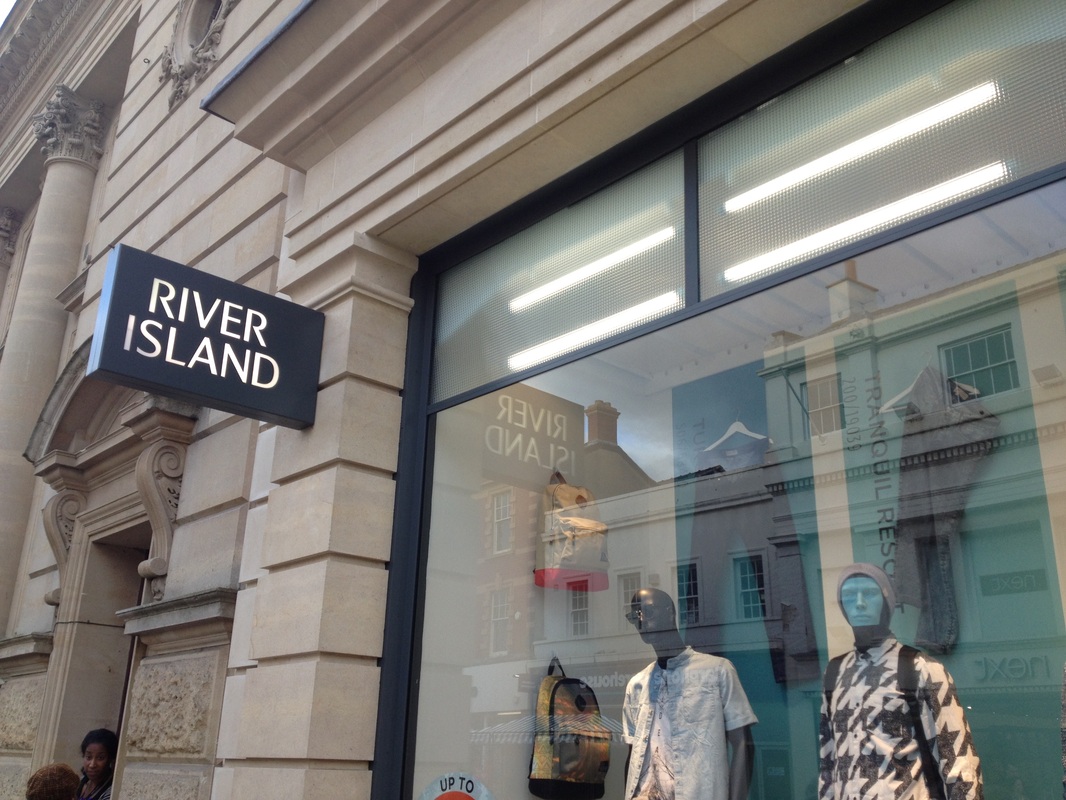
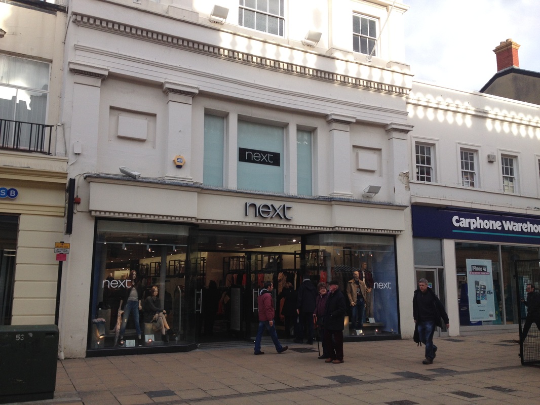
River Island is one of a couple of stores local to me in Cheltenham that I have been able to photograph, just to give an idea of what their stores are like.
Established in 1948, River Island is a privately owned British fashion empire with over 300 stores situated globally through the UK, Ireland, Europe and Asia. Specialising in high quality, stylish and affordable clothing, shoes and accessories River Island has its own in-house team of designers ensuring that garments are frequently released.
River Island has a very sleek logo using a very minimalist colour palette of black and white. This successfully emulates the brands ethos of providing 'stylish and affordable' fashions to the consumer. The online website is an extremely engaging, responsive web design that was recently launched, which successfully works across varying platforms such as mobile. This reflects its desire to appeal to a young, modern audience which it is enable to connect with using its online platform, such as its online store and social media outlets.
River Island is one of a couple of stores local to me in Cheltenham that I have been able to photograph, just to give an idea of what their stores are like.
River Island - Cheltenham Store

Primark
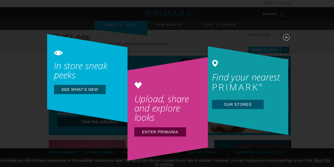
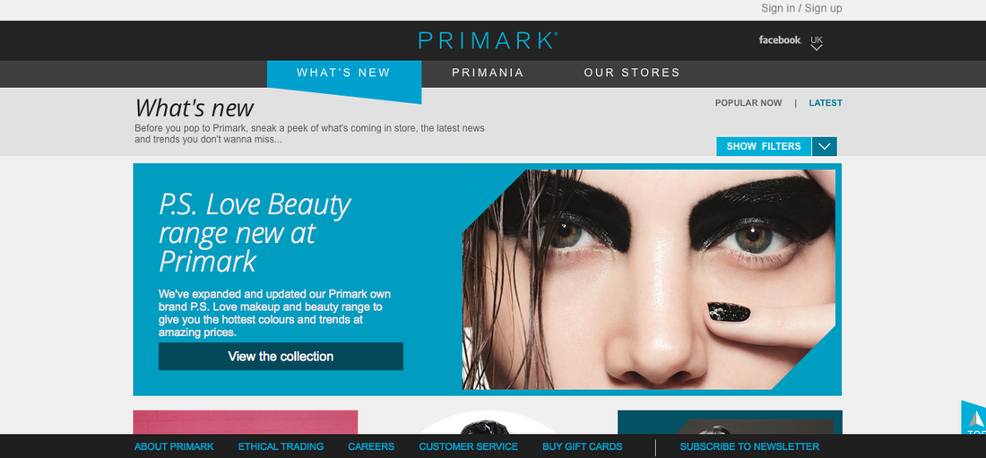
Operating since 1969, Primark is an Irish budget fashion retailer aimed at consumers looking for low priced fashion items. All of the garments sold in Primark stores are made specifically for the retailer, which has its own in-house fashion ranges such as Cedarwood State. With 257 stores worldwide Primark is a multinational supplier of clothing for the consumer that is looking for cheap, low cost items. In the past controversy has struck Primark in relation to the working of its supply chain and the working conditions of its employees manufacturing its garments in Bangladesh. This called into question the ethos and values of the company which itself had joined the Ethical Trading Initiative which revolves around the rights of workers in the supply chain.
The logo for Primark utilises quite a brash blue hue coupled with clean cut sans-serif font. The no frills aspect of the logo engages successfully with the target market as a budget retailer. The choice of blue rather than a more sophisticated colour such as black I feel demonstrates the cheaper nature of the brand.

Topman
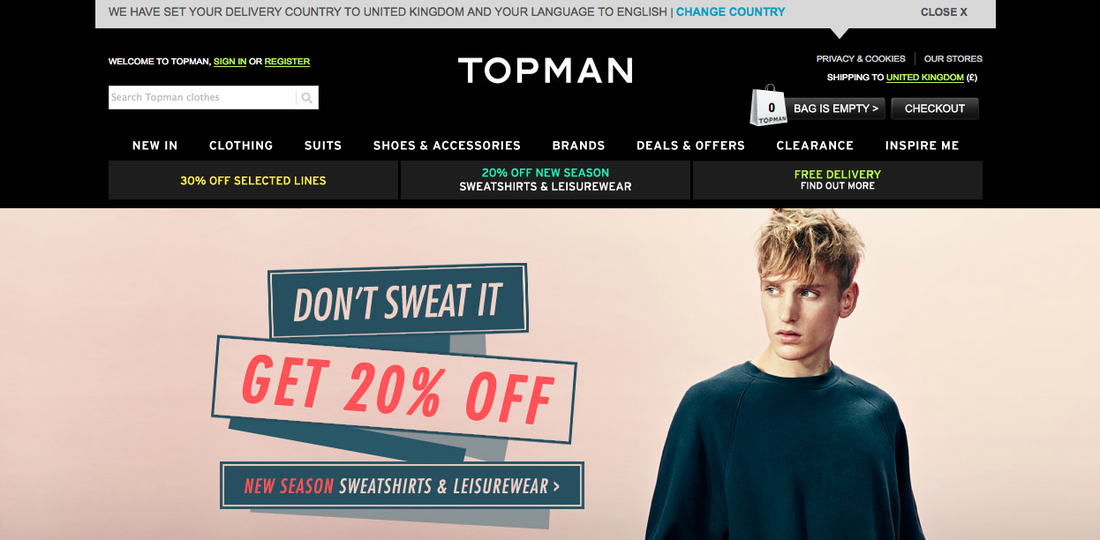
Founded in 1970, Topman is the partner to Topshop exclusively selling menswear. As part of the larger Arcadia Group which includes other retailers such as Dorothy Perkins, Burton and British Home Store, Topman in itself has over 175 outlets. With stores operating in the UK, Europe, Asia and Australia Topman is a prominent player in mens fashion with products ranging from clothing, shoes and accessories to body wash and grooming products. Topman is known for its stylish offering of fashions that ranges from the casual 'indie' look to suits and blazers catering for a large target market.
The Topman logo, like River Island utilises a very simplistic colour palette of black and white. This mixed with the very simple typeface used is a wise choice for the male target market as it is not too fussy or over complicated. Interestingly on the Topman website the colours of the logo are inverted with Topman spelt into using white on a black background banner. This once again creates a striking, clean image.
Hollister
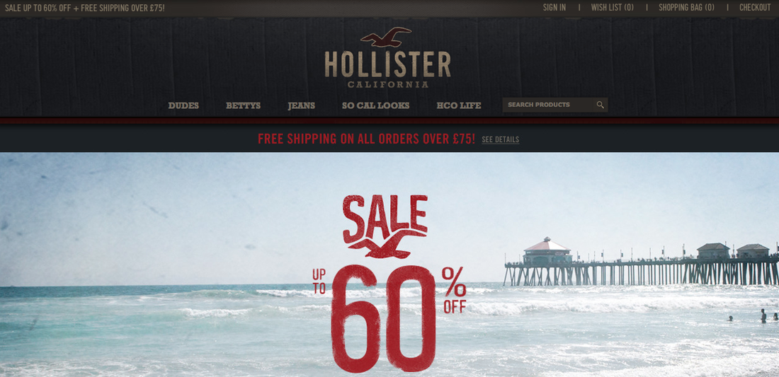
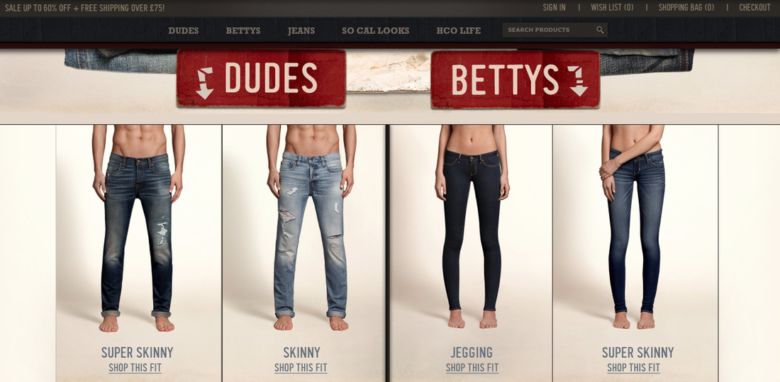
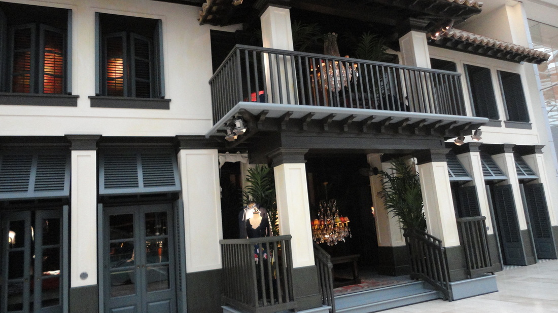
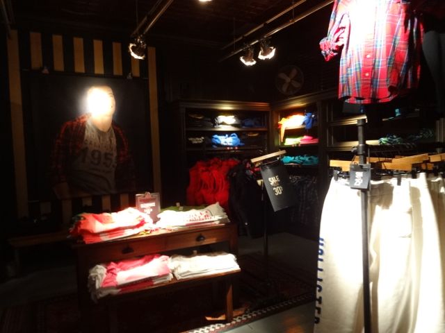
Famed for it's unique in store experience, beauty oriented elitists attitude and logo embezzled clothing, Hollister is a unique, high end fashion retailer aimed at teens and young adults. Established by the Abercrombie & Fitch corporation in 2000 the retailer aimed at 'Dudes' and "Bettys' globally has 578 stores. It's garments are well known to very prominently feature the brand name / the bird symbol used as its logo and are retailed at relatively high prices, a shirt for example costing just shy of £50. The stores themselves feature glamorous assistants formally known as 'models' who eagerly greet the consumer as soon a they enter the store. Within the store, styled like a California beach hut / pier the lighting is deliberately dimmed mixed with the aroma of Hollister perfumes pumped throughout the store and loud club like music playing. All of this combined creates the unique Hollister in-store experience which you either love or hate.
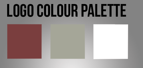
The logo itself is quite a warm palette consisting of rustic red and yellow green tone placed onto white. It helps visualise the concept furthermore of Hollister beach a beach vibes brand. It also nicely compliments the black background of the Hollister website enabling it to stand out. The red tone of the bird logo is very prominently reminiscent of the brand as it is featured on many items of their clothing and people knowledgeable of Hollister connect it with the company.
Famed for it's unique in store experience, beauty oriented elitists attitude and logo embezzled clothing, Hollister is a unique, high end fashion retailer aimed at teens and young adults. Established by the Abercrombie & Fitch corporation in 2000 the retailer aimed at 'Dudes' and "Bettys' globally has 578 stores. It's garments are well known to very prominently feature the brand name / the bird symbol used as its logo and are retailed at relatively high prices, a shirt for example costing just shy of £50. The stores themselves feature glamorous assistants formally known as 'models' who eagerly greet the consumer as soon a they enter the store. Within the store, styled like a California beach hut / pier the lighting is deliberately dimmed mixed with the aroma of Hollister perfumes pumped throughout the store and loud club like music playing. All of this combined creates the unique Hollister in-store experience which you either love or hate.
The logo itself is quite a warm palette consisting of rustic red and yellow green tone placed onto white. It helps visualise the concept furthermore of Hollister beach a beach vibes brand. It also nicely compliments the black background of the Hollister website enabling it to stand out. The red tone of the bird logo is very prominently reminiscent of the brand as it is featured on many items of their clothing and people knowledgeable of Hollister connect it with the company.
Below are a couple of images that I sourced from online that give an impression of the experience in-store at Hollister as well as the unique aesthetic that they implement within their stores.
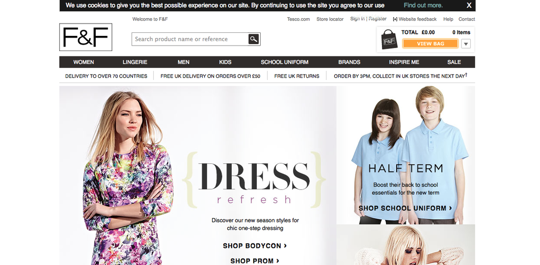
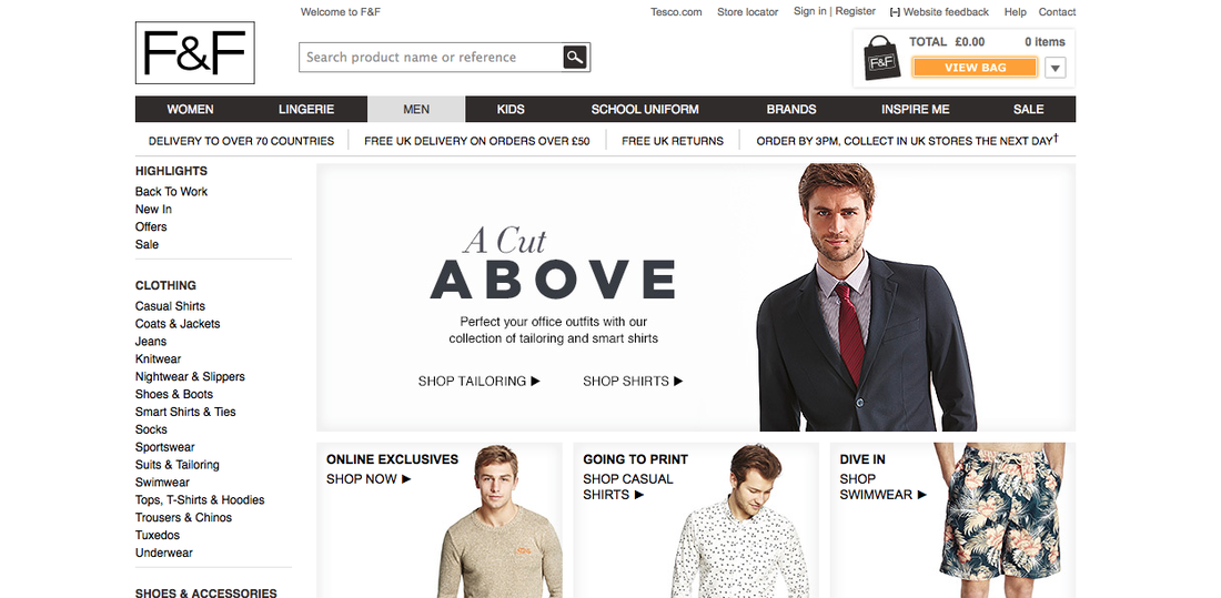

Tesco
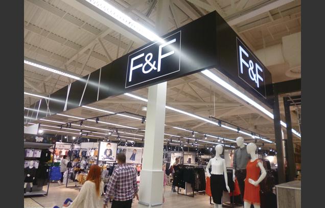
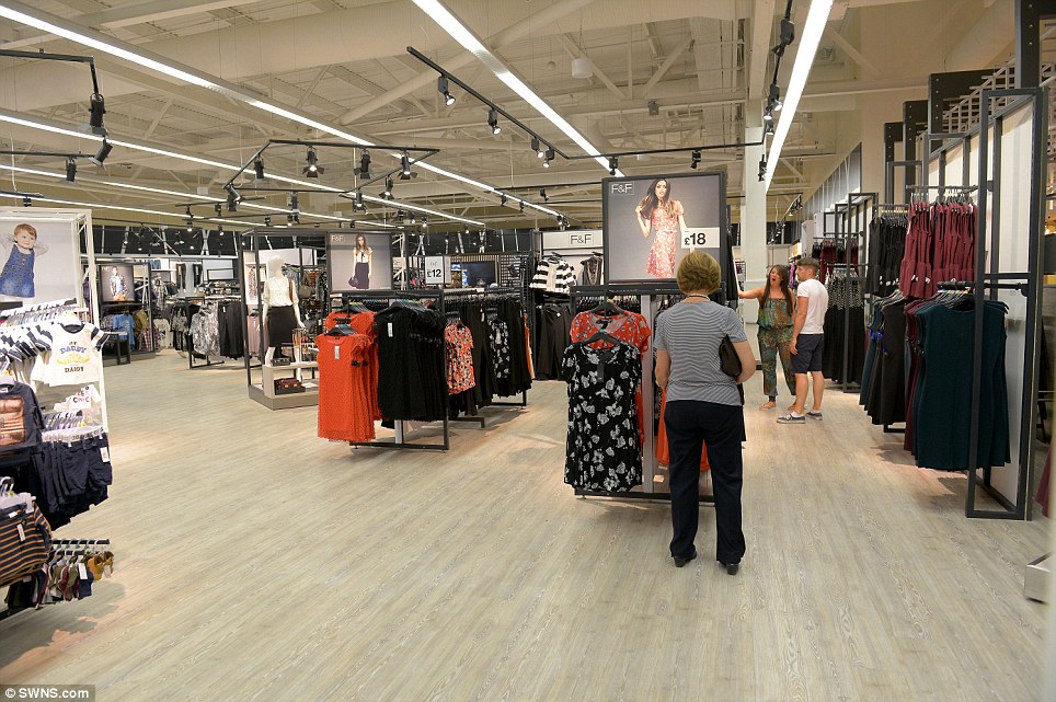
Established as far back as 1919, Tesco's long forgotten roots originate from a market stall in London. It opened its first supermarket in 1958 which included the idea of self service shopping something which at that point was relatively new to the UK. It wasn't until 1960 that they first began selling household goods as well as clothing. With Tesco's online store serving 500 000 people a week and over 6000 stores worldwide Tesco selling point to the customer is convenience, like most supermarkets. It offers a diverse range of services and products including Tesco Bank, pharmacy, opticians and insurance. Also under its umbrella is Florence and Fred a clothing range launched in 2001. The range would seem most desirable to families, such as working mothers who for convenience would be able to purchase clothes for the whole family whilst doing the weekly shop.
The colour of Tesco logo itself is quite brash. Whereas the colour scheme for F&F as it is known is once again a classic choice of black and white. Not only does this give it a simplistic, clean aesthetic but it also ensures that it is suitable for both genders as F&F clothing is made for both males and females.
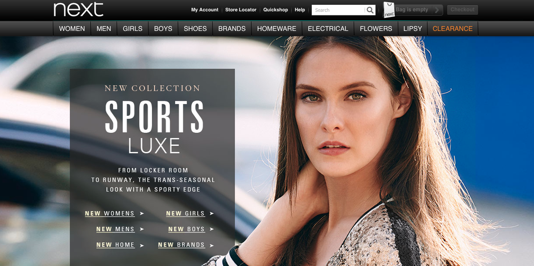
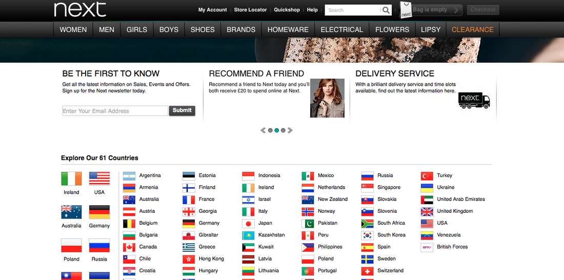

Next
Established in 1982 as a womenswear store Next has gradually grown to specialise in womens/menswear, children's clothes and home interiors operating in over 50 countries worldwide including the US. Since its inception Next has been known for selling affordable products within a sophisticated boutique like environment. The company itself is known as a reliable 'go to' destination for shoppers who are willing to pay a reasonable but not extortionate price for quality goods.
Catering to such a varied consumer base means that the Next logo and branding has to be suitable for such a diverse array of people. The simplicity of its black and white logo stands out effectively on its website, portraying a sophisticated and well made brand. The letter of the logo is also used on its signage and carrier bags thoroughly enforcing its brand marketing.
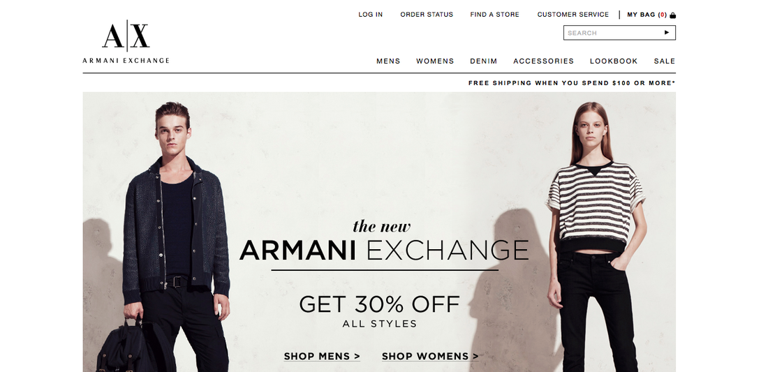

Armani Exchange
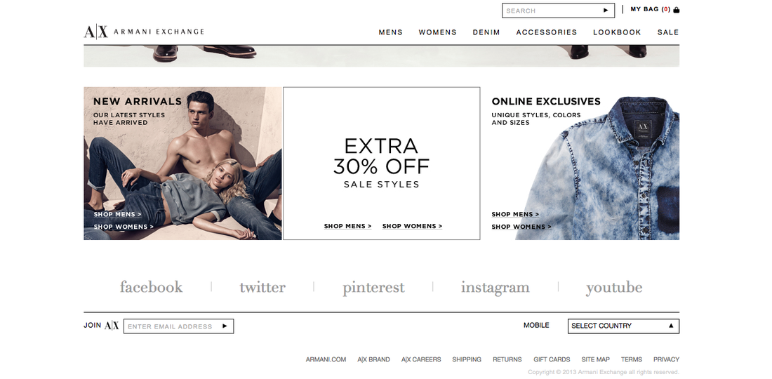
Since opening it's first store in Soho, Manhattan in New York City Armani Exchange has grown to have 264 stores operating in 31 countries around the world. The brand itself is a sub label of the Italian fashion house Giorgio Armani which itself is a global brand. Armani Exchange, whilst far superior in products and price range compared to your regular high street store is marketed at the most accessible of the Armani sub labels, producing fashion items for a younger target market.
The logo itself is sophisticated simplicity featuring a contemporary colour palette of black and white. The use of the A and X letters to create the symbol used within the logo I feel furthermore adding to the sophisticated, designer offerings of the brand. The lettering of the two symbols as well is suitably grand in aesthetic.
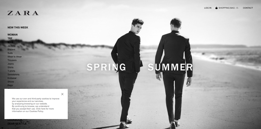
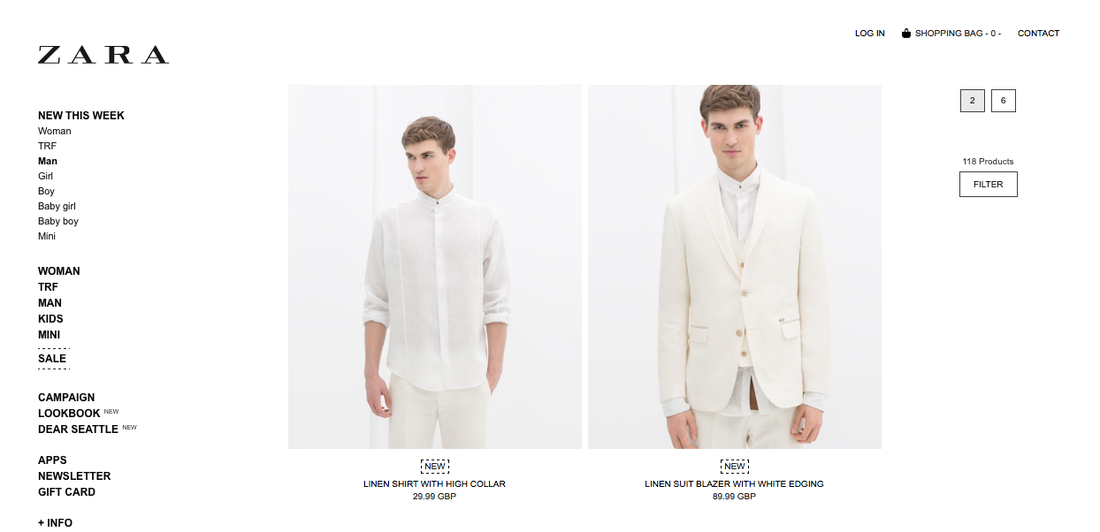

Zara is a Spanish retailer selling Clothing and accessories that was set up in 1975. The chain itself differs from its competitors in a variety of unique ways. Firstly rather than the industry standard of 6 months to design and launch new items, Zara prides itself on only taking 2 weeks from design to in store ensuring that they launch over 10 000 new items a year. Also Zara has a 0 per cent advertising structure that it uses. In fact the company spends just 0.3% of its money on advertising itself, instead using this money to launch new stores and better the overall business. Zara prides itself on being a sophisticated, upmarket shopping experience with luxurious products and stores to match. This is reflected in the fact that 50% of Zara's products are manufactured in factories in Spain, rather than being outsourced to cheaper locations in the East.
The logo, once again using the ever popular black and white colour scheme reflects the class and sophistication of the brand as a whole. The choice of the brand itself could potentially put off male consumers, by using a female name. Despite this the brand is successful in selling a prominent mens range for consumers look for a quality product.
The logo, once again using the ever popular black and white colour scheme reflects the class and sophistication of the brand as a whole. The choice of the brand itself could potentially put off male consumers, by using a female name. Despite this the brand is successful in selling a prominent mens range for consumers look for a quality product.
New Look
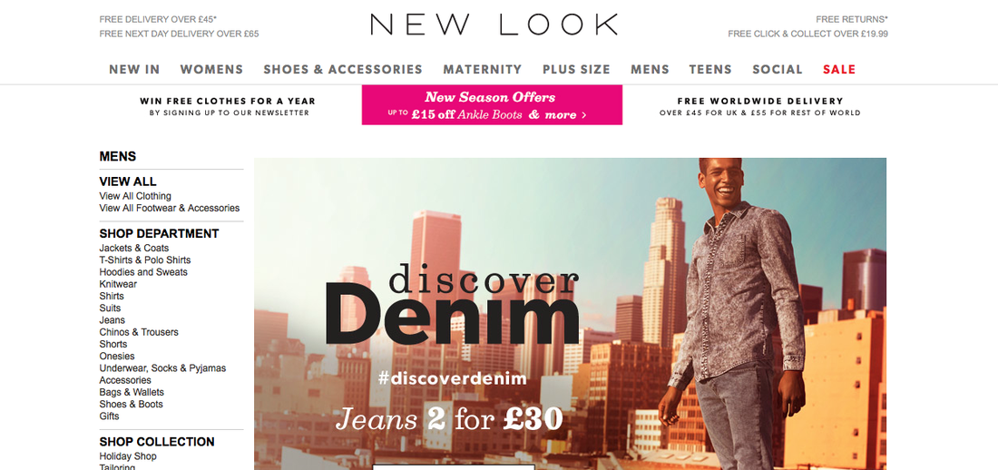
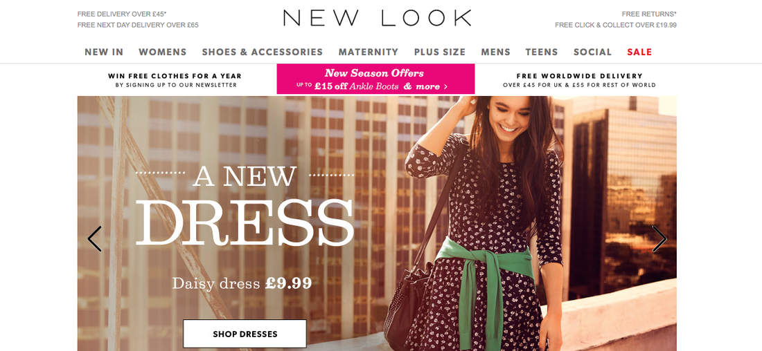
Launched in 1969 New Look is a fashion retailer that sells items catering for women, men, maternity and children. The wide range of choices available ensures that New Look caters to a wide spectrum of consumer. With stores operating throughout the UK, Europe and Asia New Look is available to a wide range of consumers globally. New Look has boosting the amount in which it utilises modern technologies, such as social media to make shopping its stores more interactive and exciting for the consumer. They pride themselves on having quite a large social media precedes with 152 000 Twitter followers and 2.8 million Facebook fans which they are able to communicate with their target market.
In 2012 New Look replaced its original hand drawn logo with a fresh new logo, featuring all uppercase type to create a more sophisticated and contemporary brand image for the company. I feel that the new logo appeals much more overall to the diverse consumer base that New Look has. The previous design which was much more curved and less 'squared' out than the new design. The logo features prominently as the header on the companies website further promoting the brand.
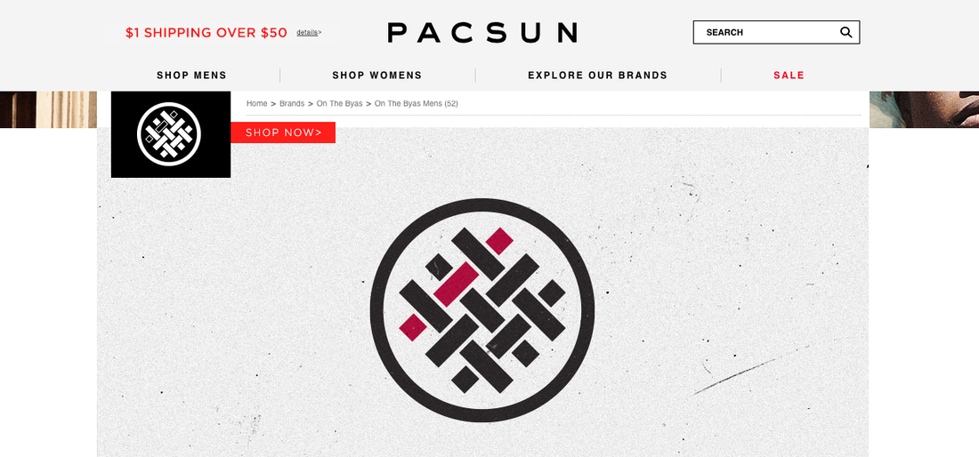
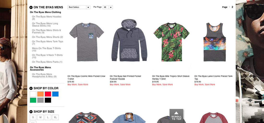

Pacsun is fashion retailer with stores open in all 50 states of the US as well as Puerto Rico. Since 1980 Pacsun has specialised in designing fashion ware that encapsulates the vibe of the youth culture of California. The clothing produced is fun and representative of the "Golden State' as California is known. Pacsun also sells items from surf and skate brands such as Vans, Billabong and Nike to once again reinforce the youth orientated intentions of the brand.
The lettering of Pacsun's logo is curved with a modern aesthetic ensuring that it appeals to its young target market. The typography itself seems quite relaxed and laid back in the way that is styled, which seems to consider the area of which the style of the brands produce is replicating.
The lettering of Pacsun's logo is curved with a modern aesthetic ensuring that it appeals to its young target market. The typography itself seems quite relaxed and laid back in the way that is styled, which seems to consider the area of which the style of the brands produce is replicating.