Creative Development
Western Clothing
To begin with I have decided that I am going to photographic several examples of my own clothing that have been manufactured in both Turkey and Bangladesh. I want to visualise the common practices that seem to be featured in Western clothing, such as the placement of labels, the information provided. Perhaps even the styles and colour palettes used on my clothing and use this as a comparison to traditional dress . clothing of the countries of which they are made in and how they are different.
|
Next - Made in Bangladesh
|
River Island - Made in Bangladesh
|
|
River Island - Made in Turkey
|
Next - Made in Turkey
|
I also scanned in the labels found at the collar of two of my t-shirts to demonstrate how the retailers package and produce the garments for selling. I am intrigued by the different ways that this was done. As on the Next item this was present on an actual tag sewn onto the t-shirt whereas the River Island t-shirt the same information is simply printed onto the garment itself.
Turkey / Bangladesh - Clothing - Where do I go now?
Going forwards with this project I want to place my focus onto the two locations of clothes manufacturing that I have selected - Turkey and Bangladesh. I have been uncertain about the ways in which I can focus this effort as there is understandably as lot of beliefs / claims / controversy when it comes to the subject of clothing be manufactured overseas, with issues such as violation of human rights and sweat shops being just a couple of the issues that darken the subject.
I feel that although this would be potentially an interesting route to go down, without being able to fully question the retailers about their supply chain and how/where their clothes are manufactured I wouldn't be able to commit to this subject matter properly and with enough respect that it deserves.
This leads me onto the idea of visualising / representing the companies behind the garnet in some way, that is positive and perhaps revealing about the places where things that we purchase come from without us even realising. I want to explore elements of both cultures, to see what visually represents them. I would quite like my focus to be on colour, as I feel that this could be exciting and hopefully lead to some interesting experimentation.
The various elements that I could consider that I have so far considered range from;
- Language and the meaning of language, exploration of Arabic (Turkey) and (Bengali). Possible examples of both languages presented in my creative work to demonstrate the culture and actual visual aesthetic of the letterings and words.
- The symbols and national icons (i.e flowers, birds) etc of the countries represented through my work. For example the moon and stars of the Turkish flag. Also the colours of the countries and their culture, colours from their flags included.
- Potential phrases that could be used to describe the nations.
- Consideration of fashion / styles / patterns included already on the fashions of each country.
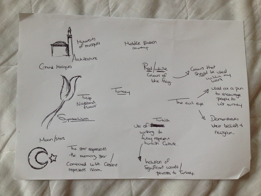
Turkey - Investigation into symbolism, colours and aspects of colour.
|
Turkey - Middle East posters using Arabic
I found this really interesting collection of Arabic typographic posters from a collection of designers. I like how the use of Arabic symbols is traditional and representative of the regions they are about, with the modern element brought in by the vector stylising. I quite like the idea of possible exploring Arabic words within my work, especially in such a clean cut manner as I feel that it would enrich my work and enhance the overall effect. Possible ideas with the use of Arabic words; - Promoting the idea of visiting Turkey - Appreciating what it does for the brands Next/River Island. Some piece of promotional material stating 'Love Turkey' in arabic, with 'River Island . Made in Turkey. For you' presented in a format that includes symbolism / colours related to Turkey. |
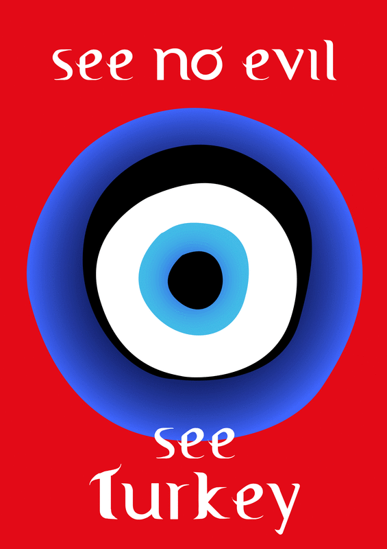
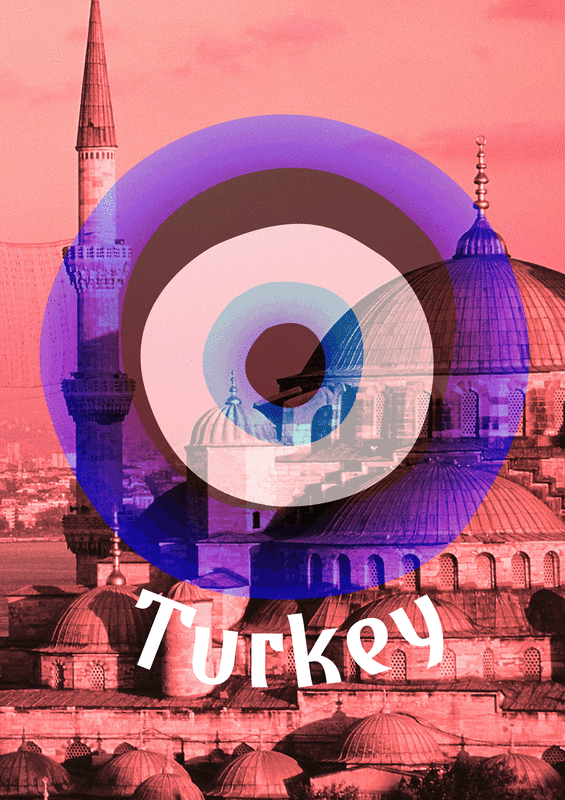
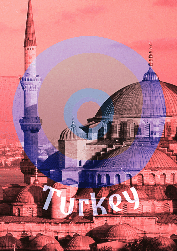
Turkey - Evil Eye
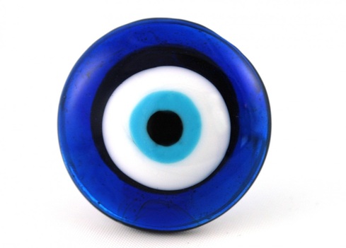
The 'Evil Eye' is musically believed to be able to cause injury and harm to the person/s that it casts itself upon due to envy and dislike. Talismans and charms, such as the one above are used in Turkey to ward off the evils of the eye. The eye itself and how it is used is quite commonly sold on novelty items to tourists and thus is well recognised worldwide. This could have potential as a spinning plot for encouraging people to visit Turkey. For example;
- A poster with an illustrated vector version of the evil featured with the slogan featured with the slogan 'See no evil. See Turkey. Visit Now' overlaid over imagery / photography of Turkey itself. |
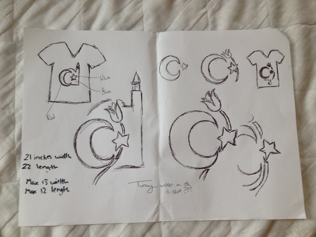
Creative Experiment - Language
Inspired by the beautiful simplicity of the Arabic illustrative posters I decided that I wanted to create something with a similar quality whilst investigating the cultures of both Bangladesh and Turkey. I deduced quite early on within this project that it would be foolish to address to countries with such a different culture to the UK in the western world and not touch upon language in some manner.
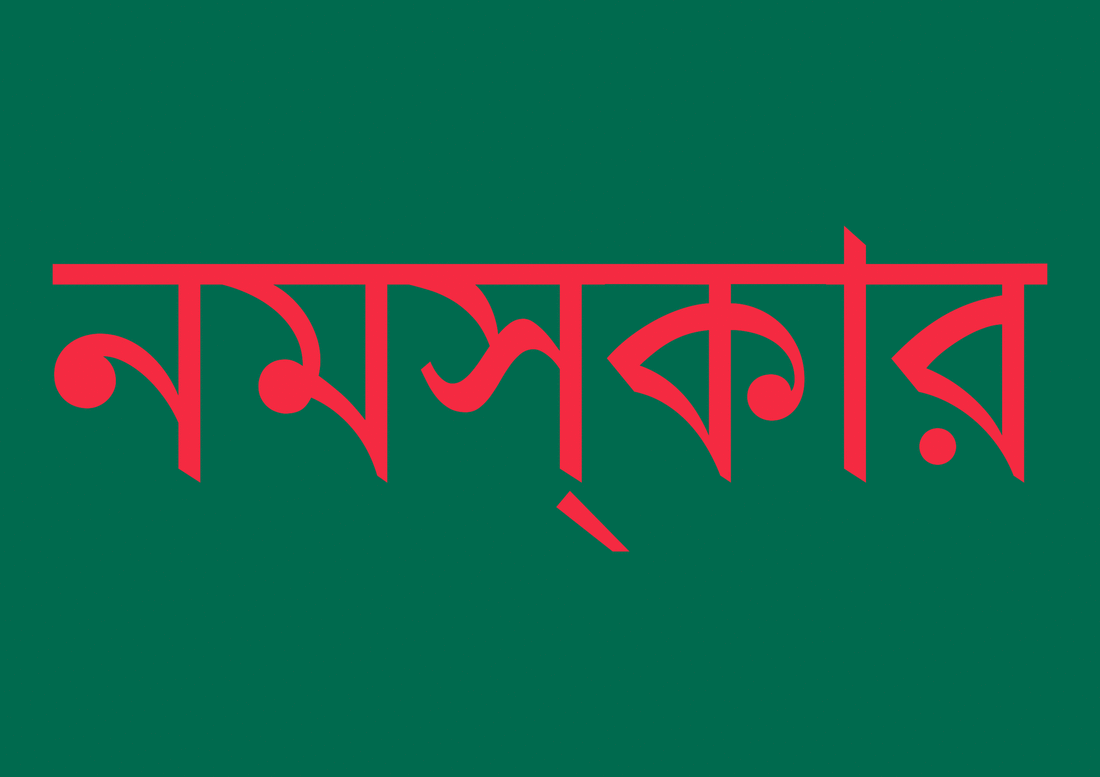
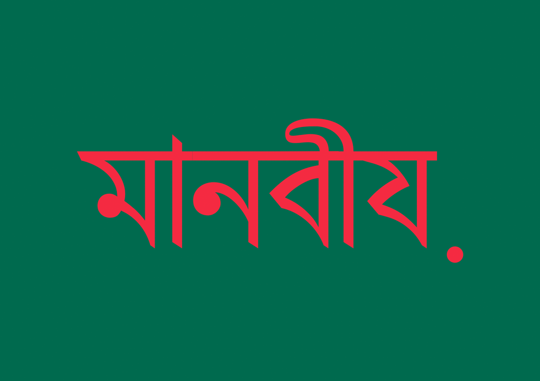
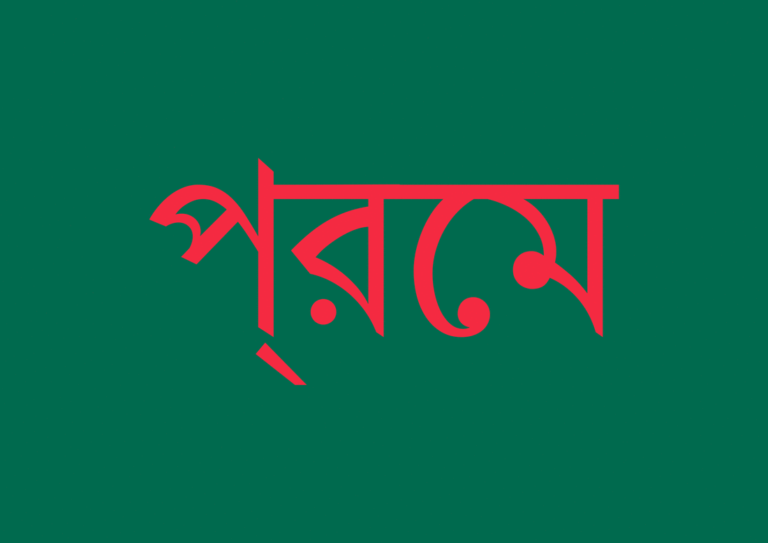
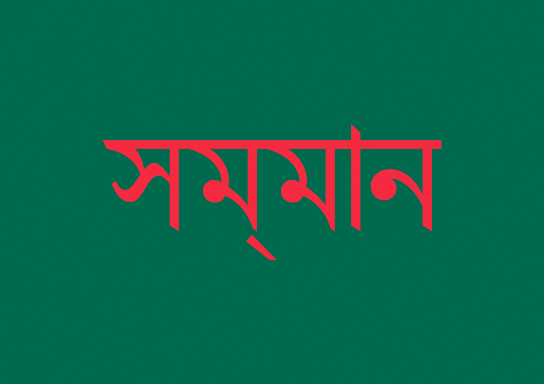
Considering the theme and basis of my project, clothing and the fact that it is manufactured in these two countries I decided to include 4 phrases written in both Turkish and Bengali that I felt were relevant.
- 'Hello' - Basic starting point of addressing someone in any language
- 'Love', 'Respect' & 'Human' in relation to the ethics of clothes manufacturing abroad. I wanted to touch upon the fact within going in to deep that it is important that workers producing the clothes in foreign countries are 'loved', 'respected' and treated fairly as 'humans'. With news articles that frequently occur of mistreatment of under park, over worked and uncared for workers in foreign clothing factories and sweatshops I wanted to address it an sophisticated and elegant manner which I believe I have achieved with these typographic posters.

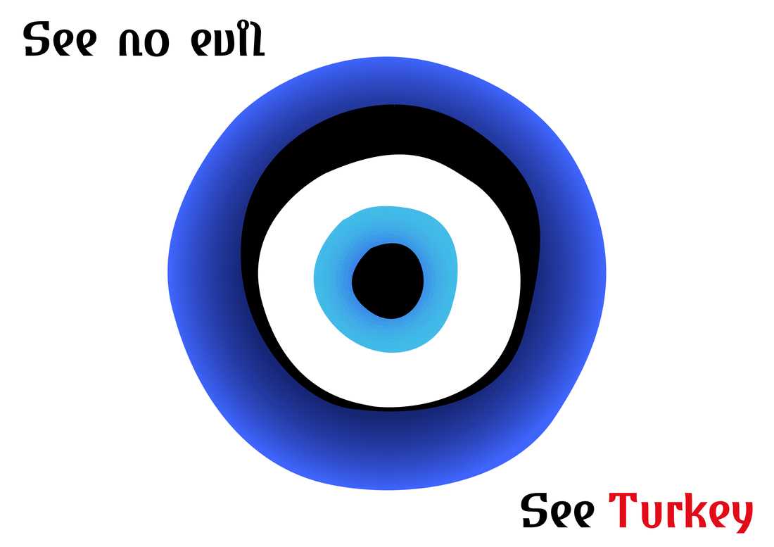
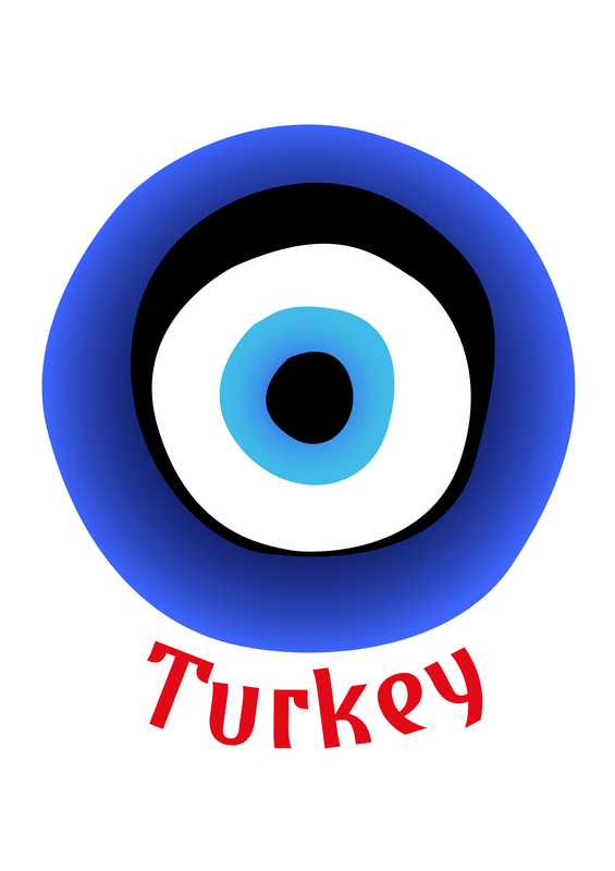
Creative Experiment - Evil Eye
Although not distinctly Turkish in its origin, the evil eye is a prevalent symbol within the country. I remember from when I visited Turkey when I was younger manner stalls/shops selling the talismans of (shown above) in the form of jewellery such as necklace beads, as hanging ornaments and further wonderful array of different formats. Therefore I think it is justifiable that the evil eye and the power belief wise that is has over the Turkish people could be utilised as a marketing tool as such to promote people to visit Turkey.
Within illustrator I illustrated the evil-eye in vector format so that I would have a high quality, adjustable version of the symbol crafted myself that I could play around with. I then began experimenting with different layouts and presentation styles and techniques that could be used alongside the symbol. I felt it was important with each composition to also utilise the vivid red (#e30a17) that is used on the Turkish flag.
Within illustrator I illustrated the evil-eye in vector format so that I would have a high quality, adjustable version of the symbol crafted myself that I could play around with. I then began experimenting with different layouts and presentation styles and techniques that could be used alongside the symbol. I felt it was important with each composition to also utilise the vivid red (#e30a17) that is used on the Turkish flag.
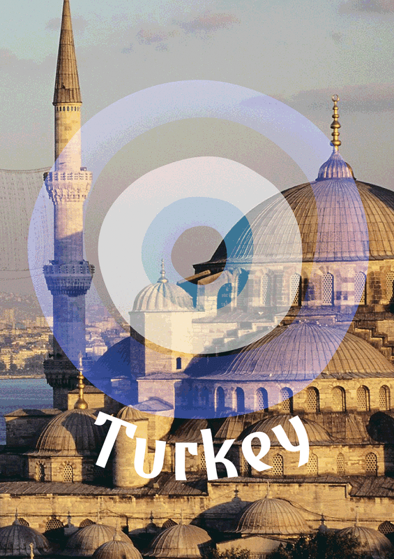
Taking my illustration into Photoshop I the began playing around with a composition format involving layering the evil-eye over a stock photography (Found here; http-//www.vilatour.com.tr/resimler/buyuk-5a0ff4520c) of Istanbul, the capital city of Turkey. I tried out several different affects, why I tried to capture the colours of the symbol itself overlaying the red used on the Turkish flag. I really like the varying effects that I got through this process. By altering layer styles and colour settings and adjustments, I was able to create 3 very different results which each have their own unique effect. This is a idea going forward that I could use to overlay other symbols / aspects of Turkey or Bangladesh over imagery of both countries cities to create interesting, slightly abstract artwork. It is also a process that with enough practice I could achieve through analogue printing techniques, such as screen-printing.
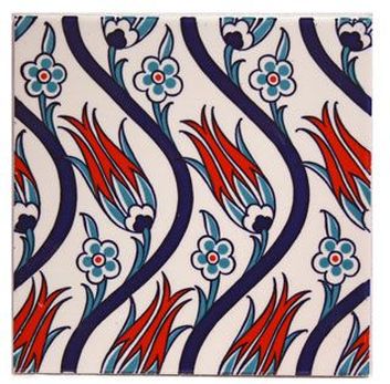
Turkish Patterns
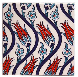
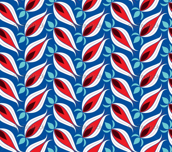
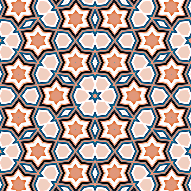
These Turkish patterns that I found are really interesting and I especially like the one which features the national turkish flower, the Tulip. Vector based illustration combined with some of the traditional patterns utilised in some manner I think could be a potentially interest and exciting way of showing Turkey and its culture in a modern, contemporary light.
I could use this in a manner ways as a reaction to the subject matter that I have selected, clothing and the origins of clothing. I could integrate Turkish inspired patterns printed onto clothing garments. This would be referencing the place where many items of our clothing are made in a way in which this is highlighted and brought to the attention of the wear. By creating a pattern using say red and white , the colours found on the Turkish flag this would help to re-enforce this idea.
I could use this in a manner ways as a reaction to the subject matter that I have selected, clothing and the origins of clothing. I could integrate Turkish inspired patterns printed onto clothing garments. This would be referencing the place where many items of our clothing are made in a way in which this is highlighted and brought to the attention of the wear. By creating a pattern using say red and white , the colours found on the Turkish flag this would help to re-enforce this idea.
I found some examples of pattern that in the past was used on Turkish pottery. The Iznik tiles and pottery and their styling is representative of the Ottoman Empire which what is now known as Turkey was once a part of. The example shown here features the Tulip, Turkey's national flower and once again features red. This exact tile/pattern is not an original, as the actual process for creating such patterns was lost several hundred years ago. This means that it is had to be re-learnt and the aesthetic re-developed in contemporary versions. Turkish pattern design quite frequently uses floral patterns, which I think is quite an interesting and distinguishable feature.
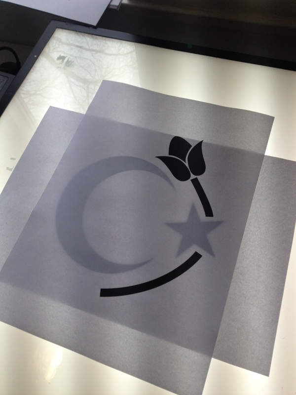
- Use of Tulip in my work in some manner? The relevance of the tulip and what it means within Turkish culture?
http://www.pinterest.com/pin/128634133080680063/
- Use of Tulip in my work in some manner? The relevance of the tulip and what it means within Turkish culture?
http://www.pinterest.com/pin/128634133080680063/
Turkish Flag - Crescent and Morning Star
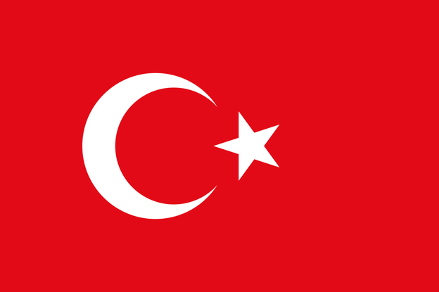
The star within the flag is thought to be in reference to the morning star which is addressed within the Koran. Combined with the crescent, the symbol that is formed is in fact a symbol of Islam as a religion.
Having visited Turkey myself many years ago, I decided that I wanted to re-fresh myself a little of the more what I suppose is the tourist natured side of the country. This Youtube clip shows a variety of destinations around the country, from Ancient ruins and Turkish Baths to outstanding mosques that are highlighted as 'must see' places. I think that some of these would be somewhat glaring and blunt to place into my work. I also prefer the idea of expressing the country through symbolism / language / colour within my work as I feel that this would be slightly more challenging and interesting to the viewer.
Turkish Development
I think going forward I have found a lot of scope for development with what I have found out in regards to Turkish culture. Key to utilise I think are;
- The tulip - a symbol that is used to represent Turkey and can be found within its history such as on tiles and pottery.
- The moon and the star - A representation of the culture/religion/beliefs of the country.
- The red and white used in the flag, they create recognition with the country and what the narrative is behind my work.
- Further use of the evil-eye? Maybe not as 'Turkish' based as some other possibilities.
- Perhaps some reference to the architecture, such as the mosques/minarets. I remember these quite prominently from when I visited turkey when I was a child. I think a combination of these and the stars and the moon would be a valid representation of the faith of the Turkish people.
Possible Creative Developments
- Digital / real life printed mock ups of T-shirts with designs similar to western t-shirts but instead featuring famous Turkish cities and landmarks
- Some form of typographic poster composed with the confines of the Tulip / Moon & star
- A material / cloth with imagery / information printed on it about Turkey sponsored by either Next or River Island
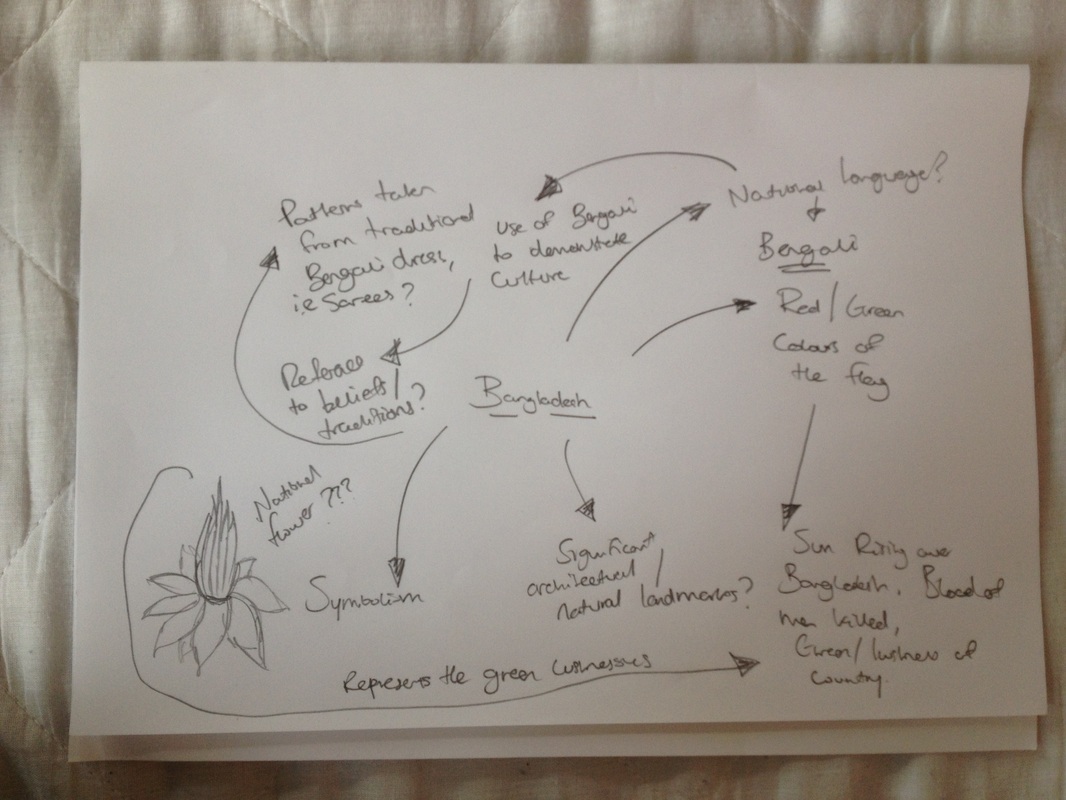
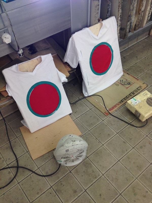
Bangladesh - Investigation into Symbolism, Colour & Aspects of Culture
Examples of Bengali Sarees
I decided to explore the traditional saree dress that is worn mainly now for special occasions by Bangladeshi women. My main interest was in the beautifully bold colours that are used on the garments. With rich greens, reds and golds frequently used as the colour for saree material combined with the intricate patterns the dresses really are a work of art when finished. The colour was the main thing that I wanted to explore and find out about as I would like to use this is as part of the expression and main impact of my work.
Nymphaea Nouchali and Royal Bengal Tiger
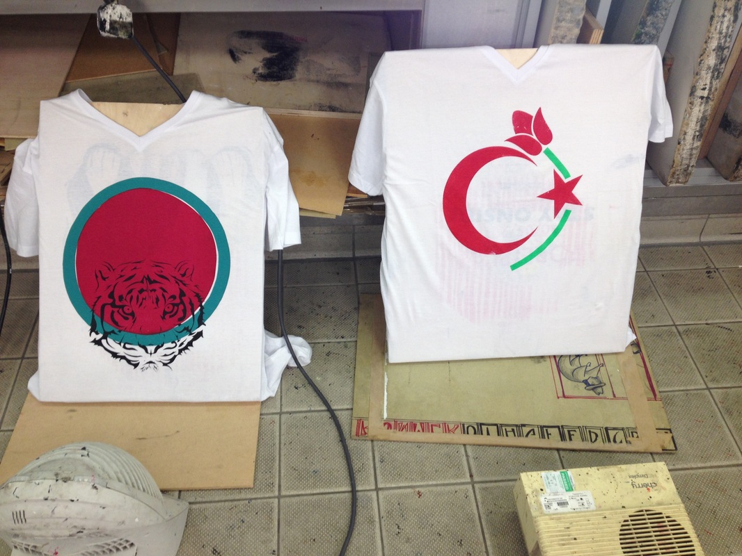
I managed to find out that the national flower for Bangladesh is a water Lily known as the Nymphaea Nouchali. Due to its beauty the flower is used as ornamental decoration and this is possibly the reason why it was adopted as the countries national flower. I also found out that the national animal for the country is the Royal Bengal Tiger. I think that there is an interesting correlation between both the Nymphaea Nouchali and the Royal Bengal Tiger in that they are both extraordinary examples of the wonders of nature and the beauty that it creates. As symbols of the country itself I would quite like to be able to feature them somehow within my work as representative images / iconography of Bangladesh.
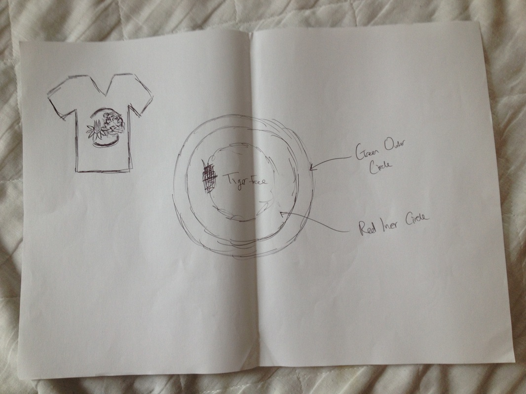
Bangladeshi Flag
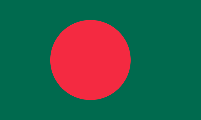
Only recent adopted in 1972, the flag of Bangladesh has a lot of symbolism contained within its design. The red circle that is slightly offset from the centre has two meanings. The first is that it represents the blood of the people who died during the fight for Bangladesh's independence. The second meaning behind the red circle is that it represents the sun rising over Bangladesh. The green background is supposed to represent the lush, beautiful landscape that makes up the country itself.
Bangladesh Development
- The colours of the flag and the meaning behind them are something that I feel I should address / continue to feature in work going forward
- Feature one of the national symbols either the tiger or the lily, not both as I don't want to create anything too 'crowded'
- Possible use of decorative pattern within my work? Once again I want simplicity, not a complicated mess.
Further project development
It is very much commonplace in Western retail stores, especially in the UK for t-shirts especially for men featuring manipulated images of famous western cities printed onto them. In a different kind of take on this, like the t-shirts above I could design and create t-shirts featuring landscapes and cities, but instead from Turkey / Bangladesh, where the clothing itself is made.
What I include;
- colours of the t-shirt be of that which represents the countries themselves, such as Istanbul in Turkey and the famous minarets of the Islamic mosques.
- City scape imagery t-shirts similar to western style clothing, but instead using Turkish and Bengali cities.
- Use of symbolism / colour reference on the t-shirts
I feel exploring the idea of clothing would be good as it ties into the core essence of my project, which at its root was about my clothing. But bringing this element into my work I would also be working with materials which I have no prior experience, a potentially challenging but exciting learning experience. I hope that if possible I could explore some forms of printing onto material if I decide to make a t-shirt, such as screen printing.
Creative Experiment - City Scape T-shirts
Following the Western styling of featuring graphic images / designs of cities and landmarks placed onto t-shirts, I have created a couple of digital mock ups the kind of garments I could create using this visual idea. I utilised stock imagery of Dhaka and Istanbul for Bangladesh and Turkey, respectively. I then played around with layer styles and colourings to create compositions that give me quite a clear idea of how they could possible look if manufactured by myself. I have do like the styling, as I myself own several t-shirts with imagery of cities on the front. But I have decided not to go forward and produce t-shirts with this kind of imagery on them purely as I feel it would simply be tweaking a pre-existing concept. Also due the locations featured being several thousand miles away, I would have to use stock imagery on my work, something I am not keen on doing. I do however like the colour choices that I made for the t-shirt. For the t-shirt of Istanbul, I used once again the vivid red from the Turkish flag. Likewise for the Dhaka composition I used the bottle green colouring that can be found on the Bengali flag. I think that colour and how I use it within the design for my t-shirt/s will be extremely important to the integrity and meaning of the design.
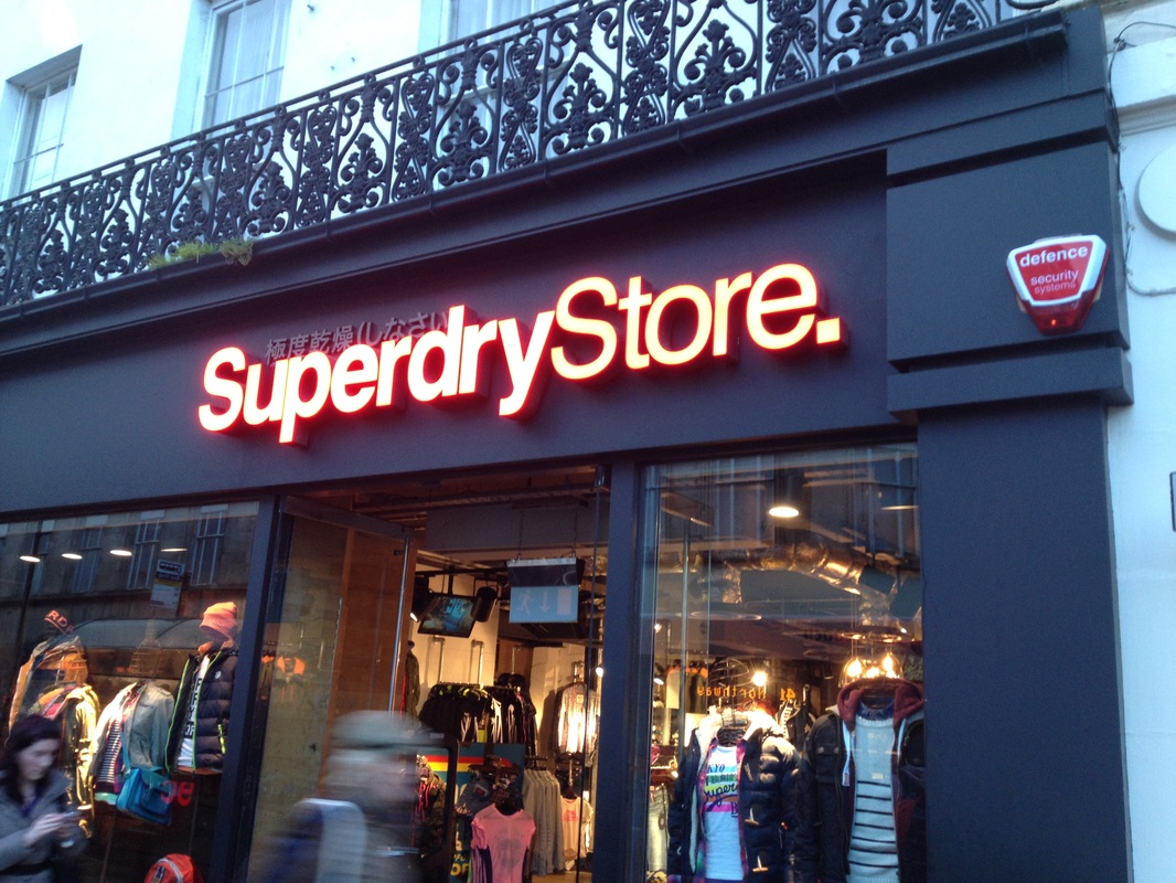
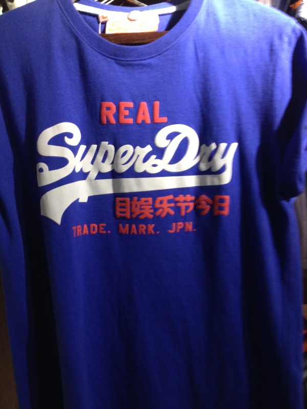
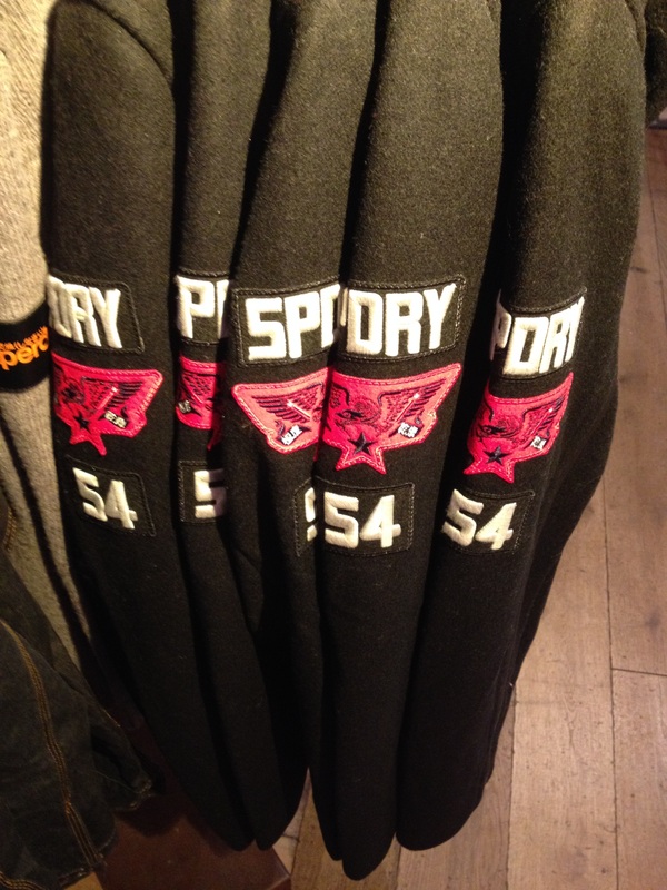
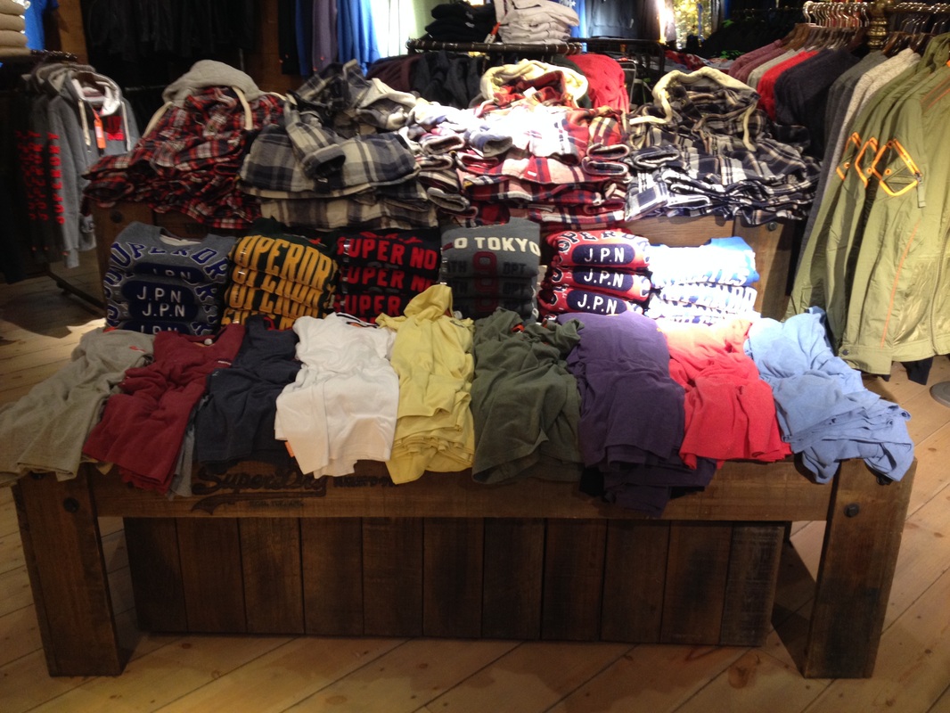
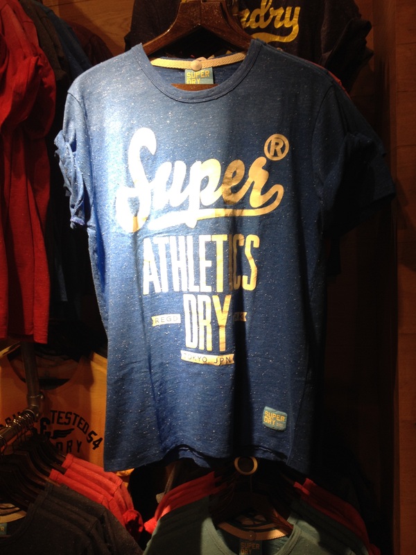
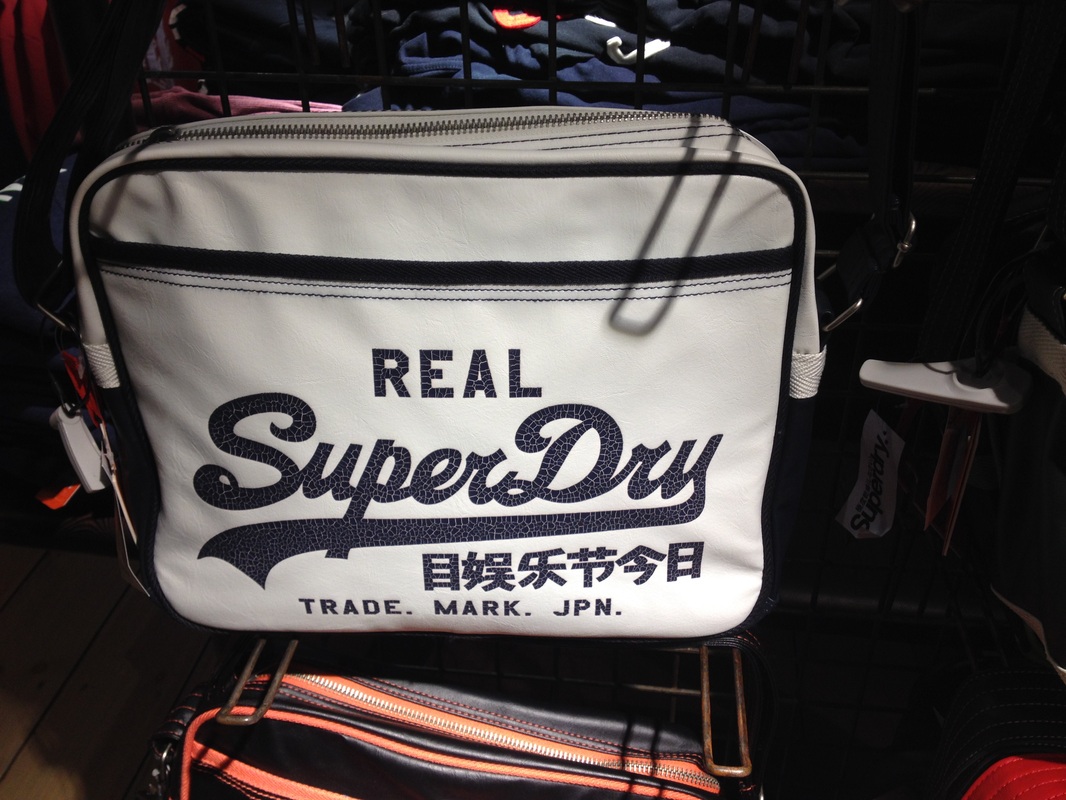
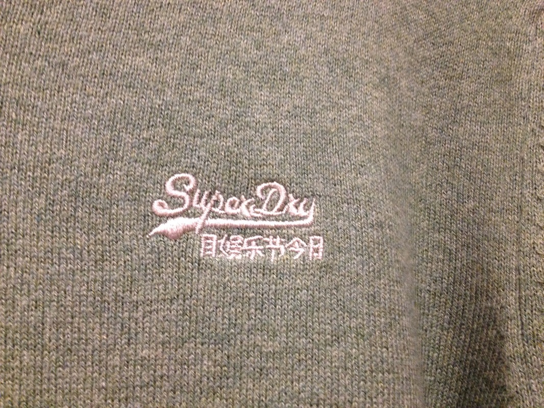
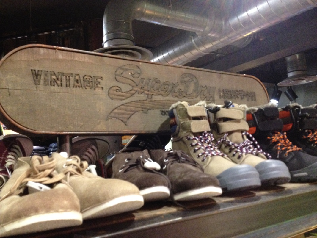
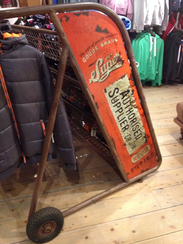
Superdry - Use of Japanese / Faux Japanese language symbols
With my idea now decided that I want to create a couple of t-shirts to visually represent Bangladesh and Turkey, I thought it would be worthwhile to take a quick trip to Superdry, a brand originating from Cheltenham itself that uses an abundance of what look likes Japanese script on its clothing. I was intrigued to learn recently that the Japanese script featured on Superdry clothing actually makes no sense, as the company simply translates words and phrases through machines rather than have a language expert accurately translate them. The reasoning behind this I would assume is that the vital aspect of the Japanese symbols on Superdry clothing is the visual uniqueness they provide, not they provide accurate reading material.
This gives me some inspiration as well going forward with my own work. I am growing more interested in the idea of using colours / symbols etc. associated with my chosen countries within the design of my work as a form of promotional material almost for the countries themselves.
This gives me some inspiration as well going forward with my own work. I am growing more interested in the idea of using colours / symbols etc. associated with my chosen countries within the design of my work as a form of promotional material almost for the countries themselves.
Creative / Final Development - Screen/Stencil Printing T-Shirts
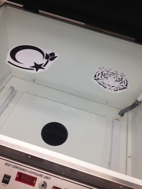
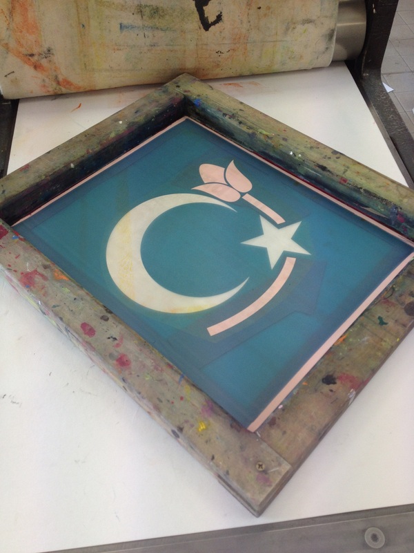
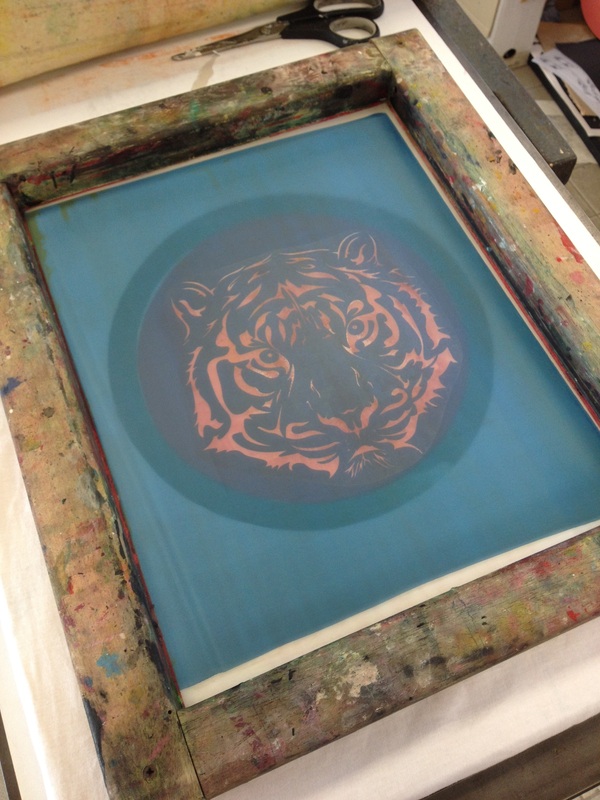
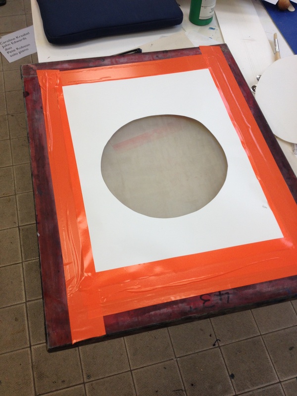
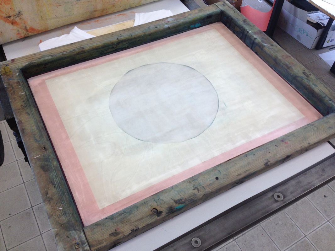
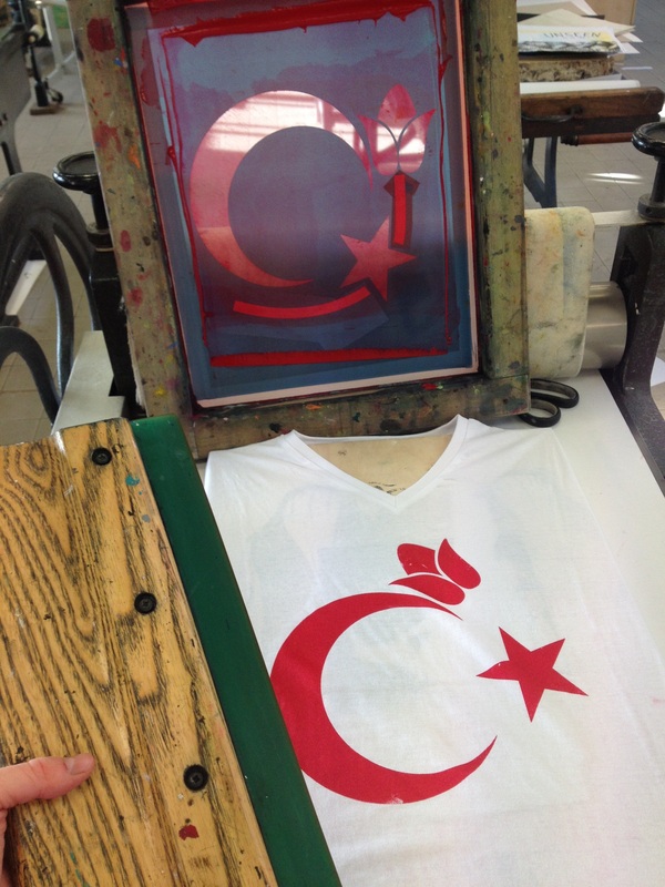
With the end of the project nearing I decided that I wanted to experiment with ways of manufacturing my work that I have not previously. I spoke to both my tutor and the print technician and I concluded that a combined use of the processes of screen printing and stencil printing would be a good way to make my t-shirts.
This was an interesting learning curve as it took me completely out of my comfort zone. At first I was quite ensure of printing as the technicalities to successfully create decent quality work was quite overwhelming. Gradually though after several hours in the printing room I successfully printed 4 t-shirts, 1 of each design a test print, 1 of each design as a final finished product.
This was an interesting learning curve as it took me completely out of my comfort zone. At first I was quite ensure of printing as the technicalities to successfully create decent quality work was quite overwhelming. Gradually though after several hours in the printing room I successfully printed 4 t-shirts, 1 of each design a test print, 1 of each design as a final finished product.
Finished Printed T-Shirts
